
Note: My editor (that’s me) has been messing around with the blog theme this weekend. If you see a few odd things (that’s actually normal for this site), please cut me some slack. In the meantime, I’ll have a word with the editor.
GSX (GSX Techedu Inc) has been the subject of a lot of negative press of late. I thought it would be interesting to see to what extent this is reflected in the price, volume and relative strength of the stock. Is the negative press justified? Let’s look at multiple time frames and see what we can see.
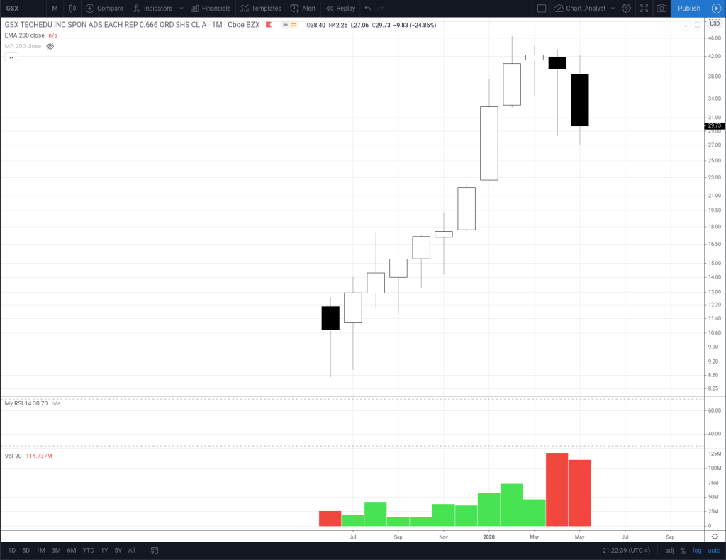
First, the monthly chart. GSX has only been trading on the NYSE since June 2019, so we only have twelve bars to examine. Not enough data for an RSI or a EMA, so we look at the price, candles and volume. The stock has risen steadily except for the last 3 months. These candles were a doji followed by two black candles with extremely high volume, which could be interpreted as a topping pattern.
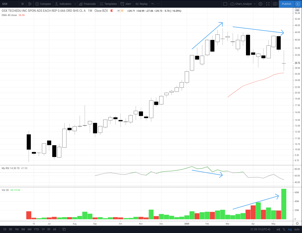
Next, the weekly chart. Now we have enough bars for a 14 period RSI and a 40 period EMA. RSI peaked the week of Jan 13 2020 and then started dropping, while price continued to rise – a bearish divergence. Price peaked the week of Feb 24 with a doji candle. This was followed by a shallow downtrend in price and rapidly increasing volume. Neither positive developments. However, this is all happening while price is above the 40 week EMA, so it is conceivable this is just a normal correction in a steady uptrend. Last week’s candle was another doji on extremely high volume (the volume bar is painted green, but only by a gnats eyelash). It remains to be seen if this is a reversal doji or a continuation doji.
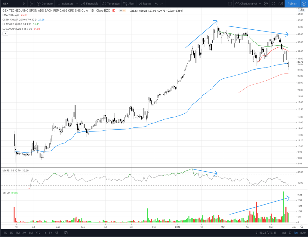
For the daily chart let’s add another tool, the Anchored Volume Weighted Average Price (AVWAP). We want to look at the VWAP, anchored from the IPO, High, Low and other significant points such as gaps. Price is currently below the High AVWAP (green line) and the Low AVWAP (red line). Price crossed below the IPO AVWAP (blue line) this week and finished slightly above. So current price is at the average price paid for the stock since the IPO. This is a significant inflection point and critical support. If price falls below this and the 200 day EMA, that is obviously not a sign of a healthy stock.
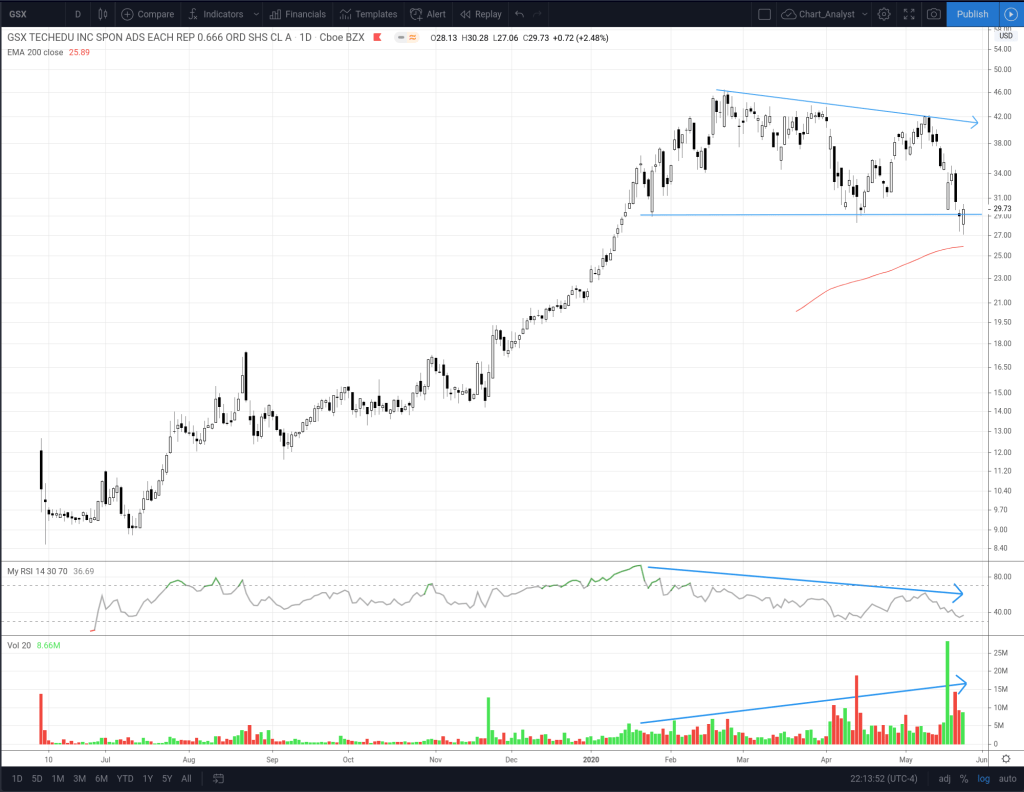
This next view of the daily chart shows a descending triangle, which is traditionally considered a bearish pattern. Relative strength is weak, and volume is rising. Note that price has penetrated the lower boundary of the triangle this past week, but recovered enough to finish the week narrowly above.
While the stock is at an important inflection point and could go either way, the data points to lower from here. Plan your trades accordingly, and be prepared for either outcome.
Disclosure: I am short GSX stock and long GSX puts.
